
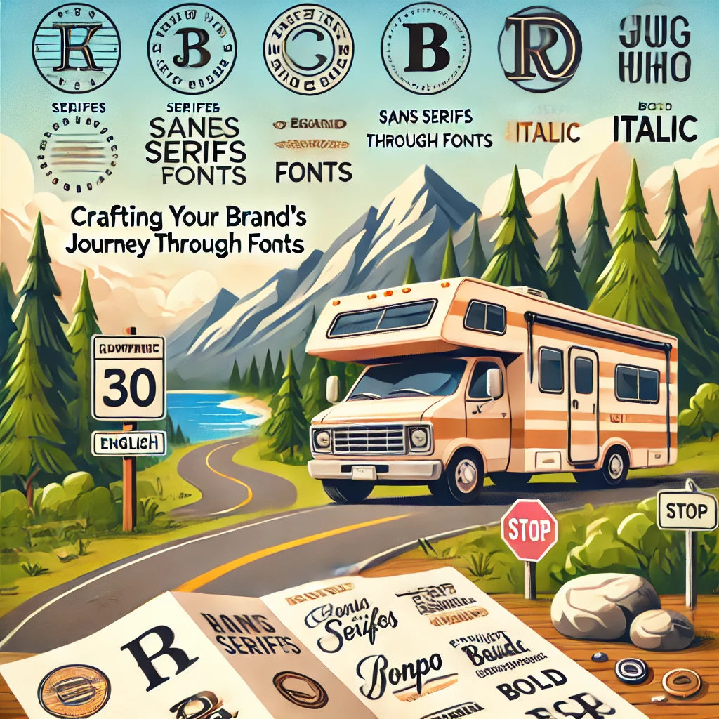
Fonts are more than just characters on a page; they are the signposts of your brand’s journey. Much like a meticulously planned travel route enriches the exploration experience, the right typography steers your audience through your narrative with ease and elegance. This article delves into the art of choosing fonts that embody the adventurous spirit of RV travel, harmonizing with the essence of nature and the thrill of discovery. Each typography tip we explore is aimed at making your message as inviting and readable as the panoramic vistas your audience loves to explore.
Choosing Your Brand Fonts & Typography: A Roadmap for Visual Storytelling
Your logo might be what first catches the eye, but the typography that follows is what keeps your audience engaged. Selecting the right typefaces is crucial, akin to choosing the right gear for a cross-country trek—it can make or break the journey. Even seasoned designers can find the world of fonts daunting, but ignoring these details is not an option when you’re sculpting your brand’s identity.
- Master the Language of Typography Understanding the jargon—serifs, sans serifs, descenders, and more—is your first step. It’s like learning the local language before visiting a new country, enhancing your experience and ensuring you pick the type that truly fits your brand’s narrative. Dive into resources like Jim Williams’ “Type Matters,” a guide that helps demystify the complexity of typography.
- Embrace Typeface Families Just like families in a community, typeface families include varied personalities—bold, light, italic, condensed—that work harmoniously under one typographic roof. Using a consistent type family across your materials creates a cohesive look, much like a well-coordinated travel itinerary.
- Adhere to the Grid The grid in typography is like a map grid; it ensures every element is aligned and in its rightful place, creating a balanced, pleasing layout. While creativity can lead you off the beaten path, returning to the grid keeps your typographic journey on track.
- Manage Your Margins (Rags) ‘Rags’ refer to the uneven edges of text in a block. A clean, even rag is like a well-tended trail, inviting and easy to follow. Ensuring your text blocks end uniformly can make your content more digestible and visually appealing.
- Avoid Orphans Leaving single words at the end of paragraphs is akin to leaving a traveler behind. It disrupts the flow and shows a lack of care in your text layout. Ensuring paragraphs are well-adjusted so each line supports the next enhances readability and aesthetic appeal.
- Create Breathing Room (Whitespace) Whitespace in typography is like open space in nature—it’s essential. Cramming words without adequate spacing is overwhelming; giving words room to breathe makes your content more approachable and easier to navigate.
- Vary Weight for Emphasis Changing the weight of your typeface can add drama and interest, much like the changing landscapes on a scenic drive. Use varying weights to guide your reader’s attention and emphasize key points in your text.
Visuals That Speak Volumes To truly bring these tips to life, consider integrating images that show examples of well-executed typography in branding, perhaps before-and-after scenarios or case studies from well-known outdoor and travel brands. Visuals that illustrate the impact of good typography can transform abstract concepts into tangible insights that resonate with your audience.
By understanding and utilizing these typography principles, you can ensure that your brand’s voice is not just heard, but also felt. The right typography doesn’t just convey your message; it makes your audience feel at home, no matter where the road takes them.
Looking to add some urban flair to your projects?
Check out these fantastic collections of free urban and graffiti-style fonts:
Here are some links to collections of urban and graffiti-style fonts that you can download for free:
DaFont: Offers a wide variety of graffiti and urban fonts.
Link: https://www.dafont.com/
Some of the most popular ones include “Graffiti Urban,” “Docallisme On Street,” and “A Dripping Marker.” You can explore and download these fonts here.
FontSpace: On this platform, you will find over 200 graffiti and urban fonts.
Link: https://www.fontspace.com/
Some notable ones are “Dirty Boy,” “Street Explorer,” and “Attack Graffiti.” You can explore the complete collection here.
1001 Fonts: This site offers an extensive collection of over 860 graffiti fonts.
Link: https://www.1001fonts.com/
Some popular ones include “Don Graffiti,” “Street Wars,” and “Gemstone.” You can explore these options here.
Whether you’re designing a street art-inspired logo, a hip event poster, or just want to add some edgy vibes to your work, these fonts are sure to make your project stand out!
With love,
Your friends on the road,
Todd & Naty Ros